Art 1 Sullivan Cheever
Tuesday, May 28, 2013
Escher Inspired Perspective
We worked on a pencil drawing that was inspired by M.C. Escher that focused on perspective. We began by learning the steps to create different images using 1point, 2point, and 3point perspective. We implemented these skills in our drawings by placing our points on seperate wings of paper and drawing a building of our choosing. I chose to do a castle because ever since I was a little kid I have been fascinated by castles and I love to draw them. I first made a box then added in all of the details of the stone and pillars with each part pointing towards my vanishing points. Then I added a background and a mythical creature, which in my case was a dragon. I added shading and cast shadows to the drawing in order to give it some dimensionality.
Acrylic Landscape
The composition of my painting is an actual landscape of a mountain scene in Colorado. I used a picture that I had taken when we hiked up a mountain in Colorado so I did not have to organize it any different than what was in my picture. When painting this picture one of the techniques we used to make it appear real was atmospheric perspective. Atmospheric perspective is the term used to describe how objects farther away look dulled down and look like the sky is over top of them. To create this appearance we changed the intensity of the colors that were used. To change the intensity you have to mix two opposite colors on the color wheel. By using this technique it makes the colors in the background appear dulled out by the sky. Another technique we used was to create a light source for the painting. To do this I created cast shadows on the rock and trees in the foreground. I also made the sky lighter on one side than the other to show where the sun is. To make the painting appear more life like we used a color scheme that would make it appear more real. My color scheme was a blue/green analogous color scheme. This color scheme allowed me to use any color from blue to green and any combinations of the two. I used many types of brush strokes that showed in the end to make it look like a real picture.To make the trees in the middle ground I used a triangular brush stroke that look like trees. I also used thin strokes to make the grass in the foreground. I used value in the painting to make my rock and ground look more dimensional and real. By doing this it helps develop the light source and makes it more realistic.
Ceramic Project

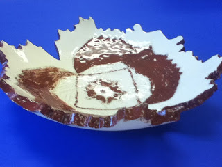
To create our ceramic bowls we used white clay as our medium. My bowl was a rather large bowl. I draped the wet clay inside a large bowl so it took the shape and size of that bowl. When making the bowl we really stressed the element of a radial design.In the center of my bowl I drew a radial design and painted over it with a red clay which made the design more visible. To make the actual bowl I used a technique called slump. The slump technique is when you place the clay when it is still wet inside of a bowl allowing the clay to take the shape of the other bowl. My piece can be used as a place to put objects such as keys and phones when you need a place to put them. I don't think my bowl would be very good for eating out of because it is not very deed and it has two large V shaped cuts out of the side. These cuts are part of the design of my object. To make this design we first took a sheet of folded paper and cut it like a paper snowflake. The paper was then laid on my clay and I cut the clay along the edges of the paper giving it the same design that was on the paper. In doing this project I learned a lot about the different stages of clay and the different things you can do with each stage. If I was to do this project over the only thing that I would change is I would like to do the hump mold technique where you drape the clay over the bowl to make the shape of the bowl
Pastel Still Life
I planned the composition of the objects of the pastel so they would provide the most interesting view and provide the best 3D view in the pastel. We created a thumbnail sketch, which is a small practice sketch that helps you to visualize the art better.It is just a quick little drawing that isn't very detailed or large. We also used a viewfinder to look at the composition of the objects so we could better visualize what we were going to draw. The viewfinder blocked out the surroundings of the objects allowing us to see just the objects. When creating the actual pastel I used multiple techniques to make my objects appear three dimensional. The main technique used was cast shadows on all of the objects. They give the pastel a 3D appearance and it establishes a light source. I also used the idea of highlights to show the rounded parts of the objects. By making the cast shadows, highlights, and changing the value of the table and background I was able to create a light source throughout my drawing. When you establish a light source it improves the quality and 3D aspect of the pastel drawing.
Subscribe to:
Posts (Atom)


